A New Periodic Table of Performance
//

Craig L. Israelsen, Ph.D.
www.7TwelvePortfolio.com
Summer 2017
The well-known Callan chart (Periodic Table of Investment Returns by Callan Associates) visually depicts the year-to-year performance of various asset classes and has been an incredibly value contribution to the literature of finance.
It provides an easy-to-understand snap shot of several key points that successful investors learn to heed: (1) past performers seldom repeat in a logical pattern, and (2) there is no discernible pattern that would allow an investor to pick the next year’s winning asset class.
There is one aspect of comparative performance analysis that is missing in the Callan chart—namely the magnitude of the performance differential among the various asset classes. In other words, there is no visual representation of how different the best or worst performing asset classes are from year to year because all the returns of the various asset classes are contiguously stacked on top of each other from high to low. In short, there is no spatial separation between the returns of the various asset classes.
This article introduces an expansion of the well-known Callan chart (see 7Twelve® Portfolio Index Performance Chart) which will be referred to simply as the 7Twelve® Index Chart. There are 12 major asset classes represented over the 19-year period from 1998-2016.
The following 12 indexes are represented in the 7Twelve Index chart: S&P 500 Index, S&P Mid Cap 400 Index, S&P Small Cap 600 Index, MSCI EAFE Index, MSCI EM (Emerging Markets) Index, S&P Global REIT Index, S&P North American Natural Resources Sector Index, Deutsche Bank Optimum Yield Diversified Commodity Index Excess Return, Barclays U.S. Aggregate Bond Index, Barclays U.S. TIPS Index, Barclays Global Treasury Index, and US Treasury 90 day T-Bill.
Each of the 12 asset classes is represented by a separate color. For instance, large cap US equity is blue, US mid cap is violet, natural resources is orange, cash is salmon, commodities is yellow, etc. The year-to-year performance of an equally-weighted, annually-rebalanced combination of all 12 asset classes (the 7Twelve portfolio) is also included and is shaded in maroon with larger white text. This is another unique aspect of the 7Twelve Chart—it also includes the performance of a multi-asset portfolio whereas the typical performance chart only includes single asset classes.
Reading the “Quilt”
In six of the 19 years the worst performing asset class was cash, but in 2008 cash was the 3rd best performer. Commodities (highlighted in yellow in the table) is often perceived as a chronically under-performing asset class, but in four years it was the best or second best performer. In fairness, it was the worst performer in three of the 19 years.
In 7 out of 19 years, emerging markets equity (EAFE EM Index) had either the highest or 2nd highest return. In two years (2008 and 2011) it was significantly at the bottom. It’s feast or famine—which suggests that the EM index needs portfolio “companions” to smooth the ride.
During some years the returns of the 12 asset classes have been more compressed (that is, more tightly bunched together). Examples of this performance “compression” would be 2001, 2004, 2010, 2012, and 2016. The compression of returns was particularly narrow in 2012, as compared to 1998, 1999, 2008, and 2009 when top to bottom performance variation was quite wide.
Diversified Portfolio Performance from 1998-2016
The 7Twelve® Portfolio Index Performance Chart – A Visual Table of Multi-Asset Performance
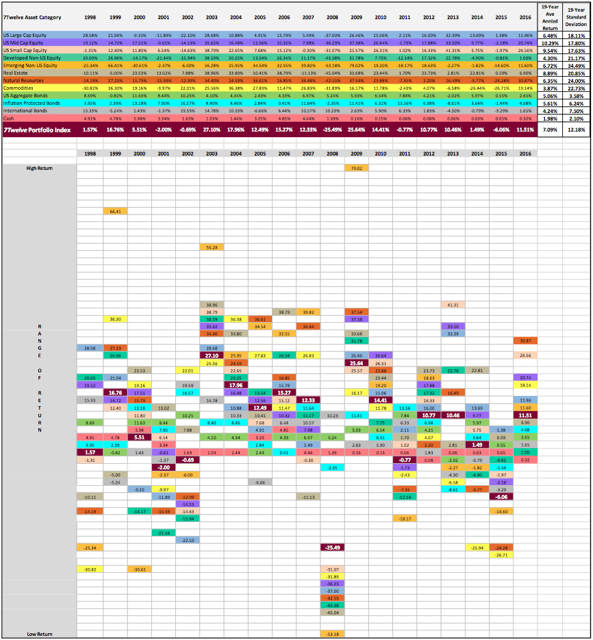
Data source: Steele Mutual Fund software, calculations by author
As with the traditional Callan chart, the 7Twelve® Index Chart reveals a patchwork of performance—hence it is often referred to as a performance “quilt”. One of the purposes of this type of visual representation of performance is to remind us all that performance across a wide variety of asset classes is: 1) highly variable, 2) past winners are not necessarily the winners the next year, 3) past losers are not necessarily the losers the next year, and 4) the variation of return from high to low can be remarkably large.
There is another aspect of this new 7Twelve® Index Chart that is highly valuable in comparison to a typical performance “quilt” chart, which is this: for the first time the performance of a multi-asset portfolio is represented. While the performance of individual asset classes is important and worth knowing, it is far more important to have a sense of how an overall portfolio is performing. Said differently, it’s one thing to evaluate the taste of all the separate ingredients of salsa, but it’s far more important to evaluate the taste of the salsa itself. The performance figures (in white text) in the maroon-shaded boxes represent the performance of a 12-asset portfolio that equally allocates among all 12 asset classes (and those equal allocations are maintained by annual rebalancing).
It’s useful to notice that the location of the maroon box (the overall portfolio or “salsa”) is never the highest and never the lowest. Being an equally-weighted mix of all 12-asset classes it represents the mean, or average, of all 12. Thus, by mathematical rule it cannot ever be the highest or lowest. Interestingly, the performance of the overall 7Twelve portfolio (when ranking the 12 asset classes from high to low) ranged from 4th place (2007) to 10th place (2015). Generally speaking it was 6th, 7th, or 8th place—exactly what we would expect from a broadly diversified portfolio.
The fact that a broadly diversified portfolio produces a middle-of-the-road return is more than simply a mathematical reality, it represents the greatest challenge faced by those who invest in a broadly diversified manner. So, what’s the challenge?
Challenge #1: A broadly diversified portfolio will never be the best performer in any given year when compared against all of its constituent ingredients (sub-asset classes). Of course, the good part of that same story is that it will never be the worst performer either—when compared against its individual ingredients!
For investors (and possibly advisors) who need to “own the winner” each year, a diversified portfolio will not be a satisfying solution. Of course, how one actually owns the winning asset class each year still remains an unsolved mystery. Even if a person could own the winning asset class in most years, they will most certainly spend some time owning the worst performing asset class in other years (as evidenced by the dramatic swings in performance of the MSCI EM Index, for example).
Challenge #2: The performance of a broadly diversified portfolio (or any portfolio for that matter) will be benchmarked against some standard of performance—and the typical standard is the S&P 500 Index (an index of 500 large cap US companies). The S&P 500 is perhaps the most well-known investment index on the planet. But, does it represent the correct performance benchmark for an investor that has a portfolio that includes US stock of all sizes, non-US stock, domestic and non-US bonds, REITs, commodities, etc.? No, it is not the correct performance benchmark for a multi-asset portfolio. Nevertheless, the S&P 500 will be used as the benchmark precisely because it is so broadly published and advertised.
Consider this, when someone asks you “So, how’s the market doing?” do you generally respond with an answer that reflects how the S&P 500 is currently performing? If so, you are tacitly agreeing with an assumption that the S&P 500 reflects “the market”. Perhaps a better response to such a question would be a follow up question something along these lines: “Which market are you referring to? The bond market, the emerging stock market, the US large cap market, the TIPS market…and so on”. In summary, incorrect benchmarking is one of the great challenges when building a portfolio that is broadly diversified. A portfolio like the 7Twelve model should behave differently than the S&P 500 because it contains many ingredients absent from the S&P 500—so it is highly ironic that a multi-asset portfolio would be criticized for behaving differently than a single-asset-class index such as the S&P 500. It’s sort of like being critical of salsa for tasting different than tomatoes (one of the ingredients of salsa).
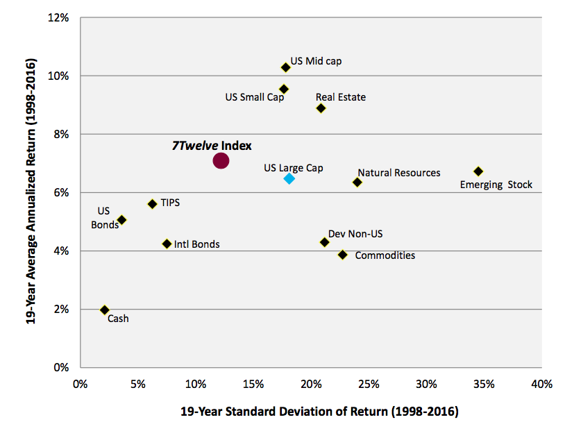
So, is middle-of-the-road performance good enough? Interestingly, the S&P 500 Index (the ubiquitous and incorrect benchmark for a diversified portfolio) finished the 19-year period from 1998 to 2016 with an average annualized return of 6.48% while the 7Twelve Portfolio had a 19-year annualized return of 7.09%. But, we must also consider risk. As shown in “Ideal Location” the risk/return location of the 7Twelve Portfolio (maroon dot) is more attractive than the location of the blue diamond, which represents US large cap stock (i.e., the S&P 500 Index) due to the fact that the 7Twelve Portfolio is much closer to the coveted northwest quadrant of the graph.
In addition, the risk/return coordinates of the other asset classes are also provided. The location of the maroon dot is arguably one of the ideal combinations of risk and return. The four fixed income asset classes (cash, US bonds, international bond, and TIPS) had lower standard deviation of return, but lower returns as well. Of the remaining 8 asset classes (equity and diversifier indexes) only three had higher return than the 7Twelve Portfolio, but each with a higher level of volatility. Five indexes had lower return and higher risk than the 7Twelve Portfolio—hence they have clearly been inferior over the past 19-years.
In the end, there is nothing average about middle-of-the-road performance.
Ideal Location
19-Year Risk/Return Map of All 12 Asset Classes and the 7Twelve® Portfolio Index (1998-2016)
Date source: Steele Mutual Fund software, author calculations